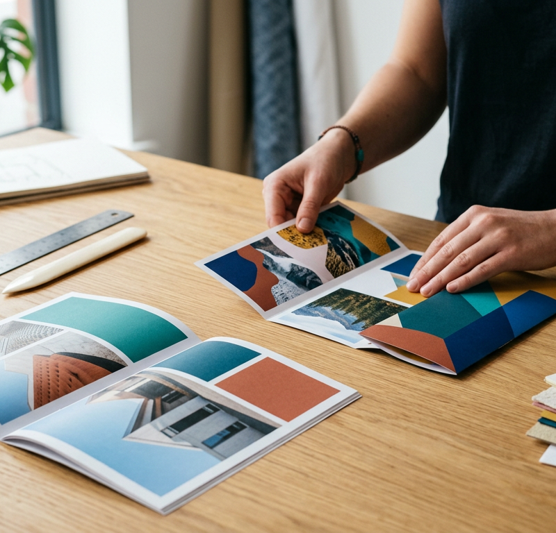
The client’s copy arrives as an eleven-page Word file, the photos sit in a shared folder under names like IMG_4471, and the request says “12 pages, A4, something that feels premium”. By the second spread the text no longer fits, the product manager wants a data table on page 5, and nobody has said whether the brochure will be stapled or folded.
A brochure layout is the arrangement of text and images across the pages or panels of a brochure, built on a format and a grid. It gets easier once the questions the brief left open are answered.
Why brochure layouts go wrong
A brochure layout goes wrong when the design starts before the basics are settled. Format and binding decide how much space each topic gets, and the copy decides how many pages you need.
If those points stay open, each feedback round can reopen them, and spreads get rebuilt late in the project. When comments then come in by email and on an older PDF, corrections end up in the wrong file.
How to lay out a brochure in 5 steps
The steps build on each other, so a late change touches one layer, not the whole document.
1. Set the goal and plan the pages
Before you open your layout software, write down who reads the brochure, the one message they should remember and what they should do next, such as call or book a visit. A purchasing department needs specifications and prices, while hotel guests need atmosphere and directions.
Then sort the content into a page plan. For eight pages it might read: cover with title and lead image, pages 2 and 3 on what the reader gets, pages 4 to 6 on products and proof, page 7 on how to order, back cover with contact details. If you can’t say in one sentence what a page is for, it isn’t ready to design. Our creative brief template helps you agree goal, audience and approvals with the client first.
2. Choose the format, the fold and the page count
Format, fold and binding set your space, so choose them before the layout and check them with the printer. The UK printer WTTB lists A4 at 210 × 297 mm, A5 at 148 × 210 mm and DL at 99 × 210 mm in its paper size guide and calls A5 to A3 the industry standard for flyers and brochures.
In the US, Printing for Less gives panel dimensions for folded pieces at 8.5 × 11, 8.5 × 14 and 11 × 17 inches. The three panels of its 8.5 × 11 inch tri-fold range from 3.6347 to 3.6987 inches, while its Z-fold panels are all the same width. So build a folded brochure from the printer’s template instead of dividing the sheet by three.
| Format | How it opens | Suits |
|---|---|---|
| Bi-fold | One fold, like a book | Short product or event brochures |
| Tri-fold (roll fold) | Two panels fold in, one after the other | Content read in a fixed order |
| Z-fold | Panels zigzag, each visible on its own | Overviews and stand-alone modules |
| Gate fold | Two outer panels open onto a wide centre | One large image or product |
| Saddle-stitched | Folded sheets stapled through the spine | Brochures with more pages |
| Perfect-bound | Pages glued into a flat spine | Catalogues and long reports |
A stapled brochure needs a page count the printer can make from folded sheets. Tradeprint asks for a page total divisible by 4 for its saddle-stitched booklets and prints them with 8 to 64 pages. A plan for 14 pages becomes 12 or 16 before the layout starts.
3. Build the grid, the type scale and the image style
Grid, type and image style are the rules every spread follows. Set them once on master pages and break them only on purpose, so a late text change stays within its column.
Start with margins and columns: fewer, wider columns for running text on a small page, more columns on a large page for sidebars, captions and tables. A photo may break the grid as long as the text stays inside it.
Try it yourself: In the demo you work in a real draftgo workspace with sample data.
Your type scale gives each level a fixed size and position, from headline to footnote. For body text, Adobe’s Creative Cloud team calls 9 to 10.5 points the “sweet spot” for brochures in its brochure design tips (Adobe, 2017). The UK charity Sensory Trust asks for at least 12 pt Arial, ideally 14 pt, captions and page numbers included, in its guidance on clear print, which it calls appropriate as a standard for all printed materials.
One type family with several weights covers headlines, body text and captions. Emphasis comes from weight or colour rather than another font, and fixed styles for subheadings and captions don’t need a new debate in each round.
Decide on the image style together with the grid, for example one kind of light and the same crop for every portrait. Put headlines on calm parts of a photo or next to it, and check contrast on a printout, because light grey text that looks refined on screen is hard to read on paper.
4. Set up the print files to the printer’s specification
Set up the document at the trim size of the order, with the bleed, safe zone and colour mode your printer asks for. The values come from its spec sheet and differ between printers and products.
For its saddle-stitched booklets, Tradeprint asks for 3 mm bleed on all sides, a safe zone of at least 5 mm and ideally 10 mm, images at 300 dpi and a CMYK PDF with fonts embedded or outlined (Tradeprint booklet specifications). Printing for Less in the US recommends 1/8 inch of bleed on each side and asks you to keep critical content at least 1/8 inch inside the trim, since trimming can vary by up to 1/32 inch (Printing for Less layout specifications).
Before you export, check the points that are specific to a brochure:
- The PDF holds single pages in reading order, the front cover as page 1, not spreads, as Tradeprint asks for its booklets.
- The page count matches the order and, for a stapled brochure, divides by 4.
- On a folded brochure, each panel has the width from the printer’s template.
- Images and colour areas that cross a spread or a fold line up on both sides.
- Text, page numbers and QR codes stay clear of the folds.
Then print the layout, fold it and hold it in your hand, as Adobe’s tips advise, since type size and proportion are hard to judge on screen. Our preflight checklist for print files covers the technical checks in full, and the prepress guide explains what happens to your file at the printer.
5. Collect feedback on one file and get approval
Collect all feedback on the current PDF in one place, each comment pinned to its spot on the page, and decide before the first round who approves. The approval then belongs to one version, and the printer gets exactly that file.
Feedback can come from several people: the marketing lead checks the message, while someone in the office checks phone numbers and opening hours. Agree who comments and who decides, and settle conflicting requests before the next version, as our guide to feedback management shows. Number each new version, as in document version control, so nobody approves an old PDF.
Brochure layout mistakes and better practice
| Mistake | What happens | Better practice |
|---|---|---|
| Layout starts before the copy is final | Spreads get rebuilt | Agree page plan and copy length first |
| Page count doesn’t suit the binding | Blank pages or cut sections | Fix the page count with the printer |
| A new font or size on every spread | Pages look unrelated | One type family, styles on master pages |
| Document set up without bleed | White edges after trimming | Bleed and safe zone from the spec sheet |
| Feedback by email on older PDFs | Corrections land in the wrong version | One current file, one named approver |
Practical example: a course guide for a language school
Take a three-person studio that lays out a 20-page course guide for a language school, A5 portrait and saddle-stitched. The director wants new students to book a placement test.
The page plan comes first: cover, welcome page, two pages on how the courses work, twelve pages of courses by level, two pages of student voices, a placement-test page with a QR code and the back cover, 20 pages in all. The studio sets a two-column grid, a type scale for course titles and prices, and one photo style.
The first PDF goes out through draftgo, with the personal approver link for the director and the shared viewer link for two teachers, who comment on the course descriptions. After the first round the school adds an evening course, which would make 21 pages and force a jump to 24. Instead, the studio cuts the student voices to one page. The director approves version 2, and exactly that PDF goes to the printer.
How it works in draftgo
In draftgo your client reviews the brochure PDF page by page through a link, without an account. Approvals run in loops, such as an internal read first and the client round after it; a project holds one loop on Free, three on Freelancer and as many as you need on Agency and Team, as the pricing page shows. Reviewers highlight a line, strike out a word or place a point or a rectangle on a photo, and each comment carries its page number.
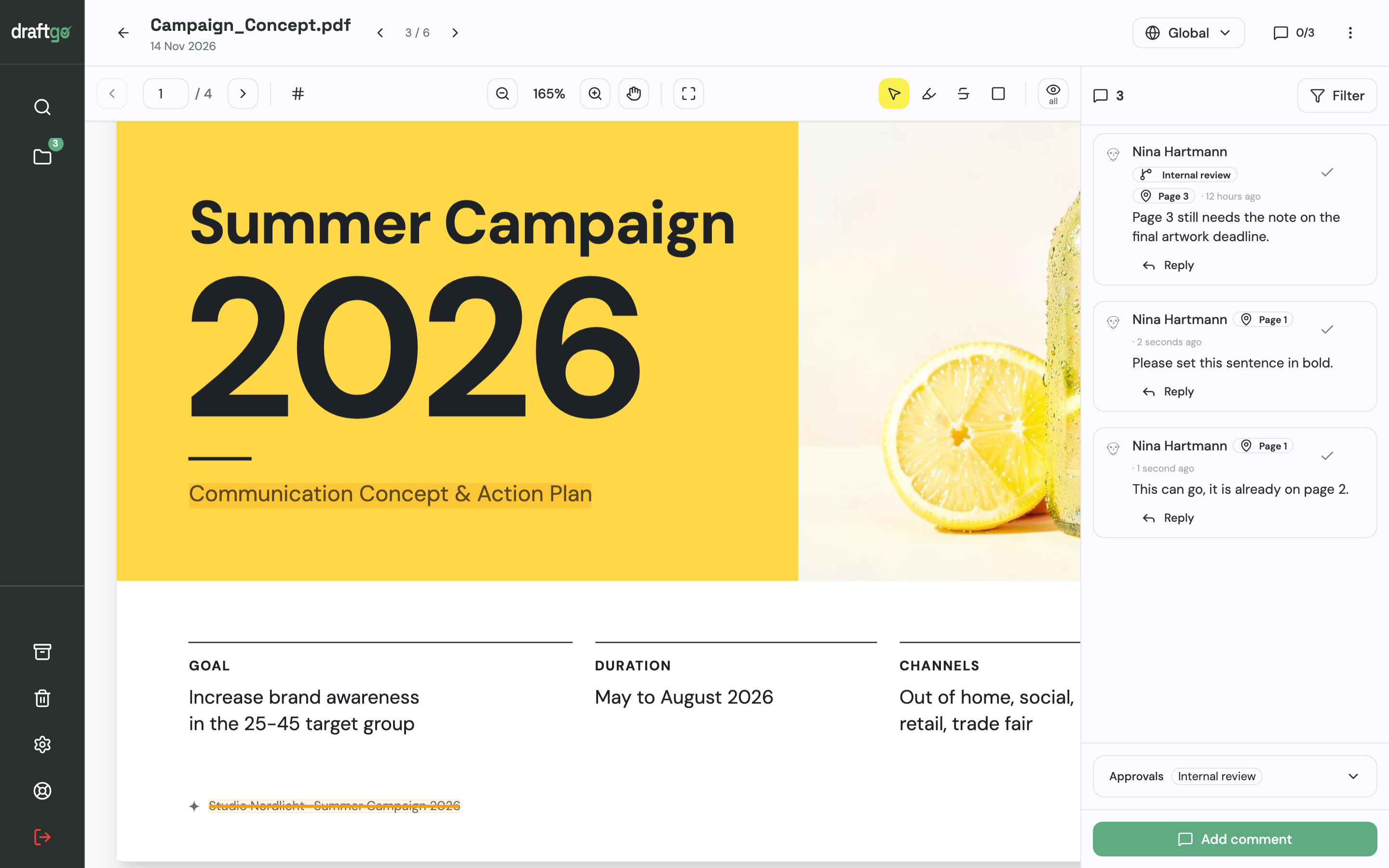
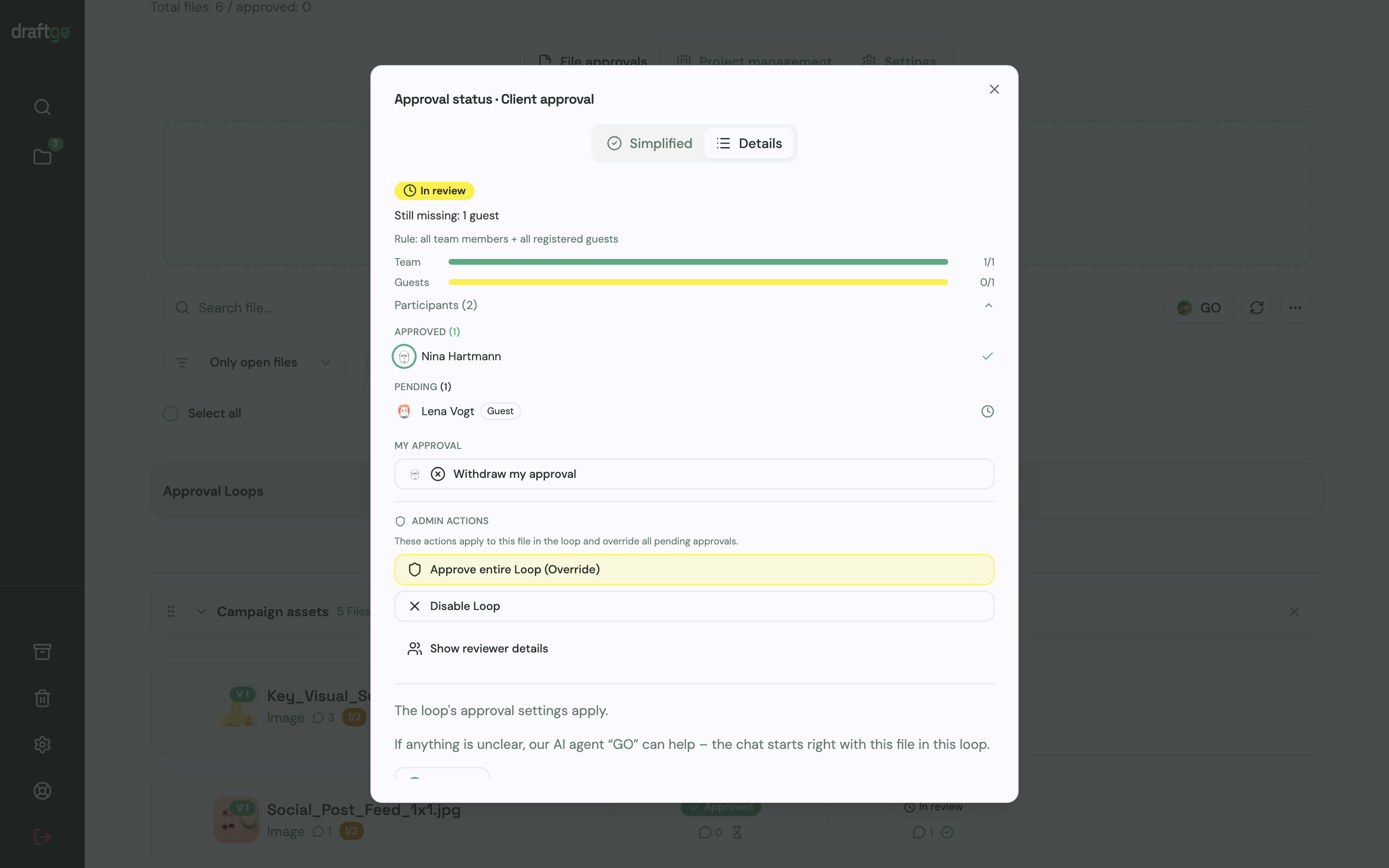
The person who decides on the client side gets a personal approver link, and colleagues who should only comment share the viewer link. For each loop you set whether all approvers, a set number or any one of them must approve, separately for your team and for guests.
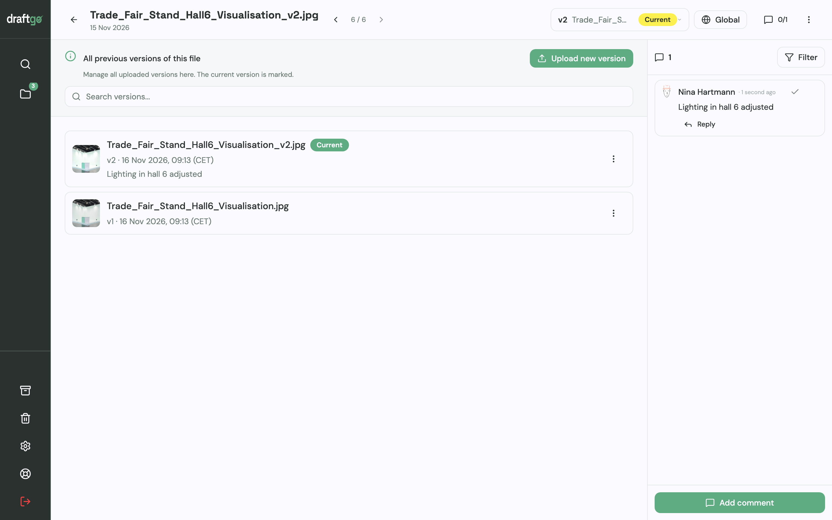
You answer questions in the comment thread and upload the corrected PDF as a new version of the same file, with a note on what changed. Earlier versions stay available, comments stay with their version, and approvals start again.
Before the client round, you can start the AI review. It checks PDFs for errors such as spelling, cut-off text or very small type and measures image resolution in print PDFs, and its findings appear as comments from our AI agent “GO”. Its pages come with the plans from Freelancer on. The technical check of the print data stays with your layout software and the printer.
You see who has approved and who is pending, and the activity log records approvals, comments, versions and downloads with person and time.
More on flyers, brochures and ads is on the page for print and advertising approval.
FAQ
What is the difference between a brochure and a flyer?
A flyer is a single sheet, printed on one or both sides. A brochure has several pages or panels, folded or bound, and leads the reader through a topic in a set order, which is why it needs a page plan.
How many pages should a brochure have?
As many as the content needs, rounded to what the binding allows. A saddle-stitched brochure needs a page count divisible by 4, as Tradeprint, for example, requires. Adjust the content instead of filling blank pages.
What font size should brochure body text be?
Adobe’s brochure design tips (Adobe, 2017) put body text between 9 and 10.5 points. Sensory Trust’s clear print guidance asks for at least 12 pt, ideally 14 pt, and more than single line spacing.
Conclusion
Lay out a brochure in this order: goal and page plan, format and binding, grid and type, print files, approval. Agree the first two with your client in writing and get the printer’s template before you design the first spread.
Try it free – draftgo is free for 14 days, no credit card needed.
Written by
Emilia
Content Producer
Ready to streamline your approval processes?
Get started with draftgo today and see how easy professional collaboration can be.